

Neisha Crosland, Paris Ceramics and the Art of Hand-Painted Terracotta Tiles
Overview
For Architects, Interior Designers and Project Teams
At Paris Ceramics, so much of what we do has you in mind. We know professional readers need more than beautiful imagery and well-turned phrases. You need material understanding that can support specification, sharpen design thinking, and add genuine value to your CPD record. That is especially true when the subject is hand-painted ceramic tiles, because this is a field in which atmosphere and technical judgement must always travel together.
To make that value immediate, we have included two CPD-friendly templates at the end of this article: one for architects and one for interior designers. They are designed to help you log the learning clearly and with minimal effort.
We think of architects, interior designers and project teams not simply as clients, but as long-term collaborators in the way we work, think, and create.
Estimated Reading Time: 26 minutes
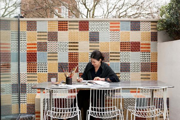
Neisha Crosland
The Delicate Power of Pattern
There are certain artists whose work seems to move naturally from one medium to another, as though the underlying intelligence of the pattern were always waiting to find a new surface, and Neisha Crosland is surely one of them. A British textile and surface pattern designer whose influences are wide-ranging, for decades her motifs have travelled across textiles, wallpapers, rugs, embroidery, and objects. Yet there is something especially persuasive about seeing them translated into hand-painted ceramic tiles.
In tile, pattern becomes slower, weightier, more architectural, colour behaves differently, and glaze catches light in unique and unexpected ways. The continuity of repeated pattern ceases to be something merely applied and becomes something built into the physical life of a room. For us at Paris Ceramics, that is where the real fascination begins.
To write about Neisha Crosland merely as a designer of exquisite or distinctive tiles would be to miss the deeper point, as her work helps reopen a much older conversation about painted tile as an architectural art form. The best hand-painted terracotta tiles have never been mere embellishment. They organise rhythm, direct the eye, alter perceived scale, and create atmosphere. They hold colour differently from paint, differently from textile, and differently from stone. They are practical, certainly, but they are also carriers of memory, cultural reference, and a distinct surface language.
This article is therefore about two distinct subjects which are necessarily inseparable. The first is Neisha Crosland’s collaboration with Paris Ceramics, expressed through four collections: Haveli, Floris, Botanica, and Modernist, with a fifth collection still in development.
The second is the historical evolution of painted ceramic tile itself: from historic tin-glaze and lustre traditions, through hand-painted and stencilled surfaces, to contemporary terracotta collections that still rely on the human hand, the chemistry of glaze, and the logic of repeat.
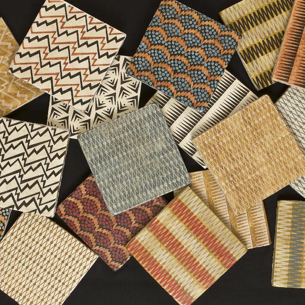
Examples of the Haveli Collection
The Paris Ceramics Collaboration with Neisha Crosland
The collaboration began, fittingly enough, with an encounter grounded in material. Neisha has described first meeting ?lvaro de Ferranti, Paris Ceramics? co-founder, while sourcing tiles for her kitchen and finding in his showroom the sense of an archaeologist?s treasure trove. There were stones, tiles, carved and painted surfaces, natural substrates that already suggested the possibility of pattern as something more permanent than print. A book on Navajo decoration helped spark the earliest collection thinking, which began not just as a conversation about material, but also about memory, and the power of repeated form.
Paris Ceramics has always been drawn to materials that carry depth, irregularity, and old-world intelligence.
For Neisha, pattern repetition has never been a flat graphic device, and she has often spoken about how it can alter one’s perception of space; how rhythm can calm or excite according to scale. That is not the language of surface styling; it is already, in effect, the language of interiors and architecture. When applied to hand-painted ceramic tiles, Neisha’s vision of pattern as structural relies first and foremost on the internal discipline of her designs.
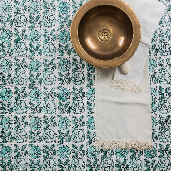
Botanica on a Bathroom Floor with Wash Basin
Pattern as Architecture
One of the reasons Neisha Crosland’s work with hand-painted ceramic tiles lands so convincingly is that her patterns already possess internal structure; they understand interval, pause, repetition, weight, and release, and they know how to move across a surface without losing composure.
In purely decorative work, pattern behaves like a graphic overlay. It hovers on top of the material, indifferent to scale, edge, and the room itself. In work like Neisha’s, pattern is inseparable from how the surface will be experienced bodily and read across the architectural envelope. It changes the feel of a wall, tightening or softening the reading of a room; it can create calm through disciplined repetition, or a low hum of excitement through sharper contrast and movement.
This becomes even more pronounced once her designs move into terracotta and glaze, because ceramic is an active material rather than a neutral support, and because each material register changes how the pattern is read. The clay body, its absorbency, the hand-painted application, and the behaviour of the glaze during firing can all alter the appearance of the pattern.
In terracotta especially, porosity and surface irregularity can soften or shift painted marks; glaze may pool, catch, or crackle; and the motif can emerge with greater warmth, texture, tonal variation, and depth. The repeat remains recognisably hers, but the material thickens it. It acquires temperature, grain, edge, and a more persuasive material presence. To better understand these nuances, let us look at her four collections one by one.
Exploring Neisha Crosland’s Haveli, Floris, Botanica and Modernist Collections
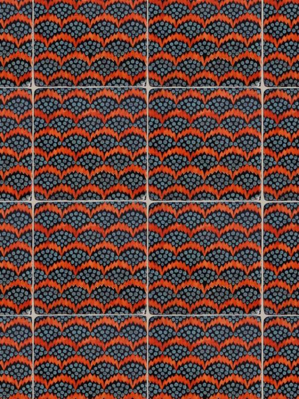
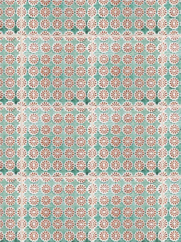
Pollen Orange Blue by Neisha Crosland – Haveli Collection
Haveli
Haveli was the first, and perhaps for that reason it still carries the clearest sense of a foundational proposition, and was the one inspired by a book on Navajo decoration. Handmade and hand-painted on glazed terracotta, with a distressed matte finish, it feels almost excavated: as though the tiles carried a residue of time.
The palette is earthy and composed, with black and cream, henna, denim, moss, yellow and reds all handled in ways that feel sun-touched rather than synthetic. The design families, from Pollen and Thunder to Z-Stripe, Lattice Dot, Boomerang and Zig Zag, show how little scale is needed when the geometry is resolved properly. Nothing in this collection is overblown, and everything depends on interval, confidence, restraint, and a carefully judged visual rhythm.
One of the unique characteristics of the Haveli collection is that it establishes several things at once: the attraction to small geometrics, the sense of patina, the refusal of polished slickness, and the belief that pattern can feel at home in both more traditional interiors and more contemporary architectural settings.
Frieda Celadon Rust by Neisha Crosland – Floris Collection
Floris
If Haveli is the more disciplined collection, Floris opens out into curl, tendril, and floral movement. It is still terracotta, still handmade and hand-painted, but its mood is more expansive. That can be seen in designs such as Dandelion Celadon and Dog Rose Ming Blue, where floral forms feel lighter and more mobile, and in Cocteau Ink Blue and Tango Ming Blue, where geometry begins to loosen into something more fluid and decorative. Even Jacob’s Tree Catkin and Marigold Cobalt show how the collection moves between botanical reference and stylised ornament without losing control.
The Floris collection is underpinned by a very particular historical intelligence. Neisha has spoken of looking at Spanish tin-glazed earthenware, especially pharmacy jars and refredadors (pierced ceramic cooling vessels) from the fifteenth and sixteenth centuries, and of being drawn to lustreware glazes.
She also connects the collection to Persian, Ming, Tang, and even Neolithic atmospheres. The point is not quotation, but tone. In pieces such as Dog Rose Ming Blue, Marigold Imperial Yellow, and Jacob’s Tree Celadon, colour is doing much of the historical work to create surfaces that feel old-world without becoming imitative.
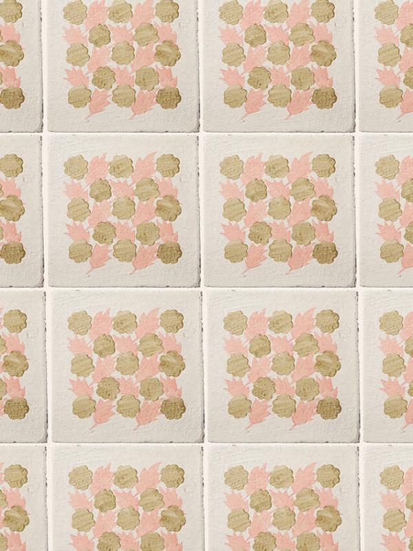
Lily Pond II Negative Olive Coral by Neisha Crosland – Botanica Collection
Botanica
Botanica is the most overtly floral of the four collections, and in some ways the most painterly. Its finer lines and softer, watercolour-like handling can be seen in designs such as Gardenia Bluebell, Gardenia Orange Rose, and Florissa Green, where the drawn quality of the motif remains visible even after firing. Screen printed and then finished by hand on crackle eggshell glaze terracotta, these tiles feel delicate without becoming slight.
The inspirations are broad but vividly chosen, from Emil Nolde’s flower watercolours and Persian illuminated manuscripts to Ottoman interiors and Roman villas. That breadth begins to make sense when one looks across the collection itself: the more lyrical movement of Lily Pond I Positive White Smoke and Lily Pond II Positive Lupin Olive sits alongside the livelier nature of Can-Can Single Primrose, while Tulip Lined Jade Pink brings a more structured floral rhythm. Botanica is varied, but not loose. It is concerned with movement, freshness, and ornament that remains composed even at its most expressive.
Top of Form
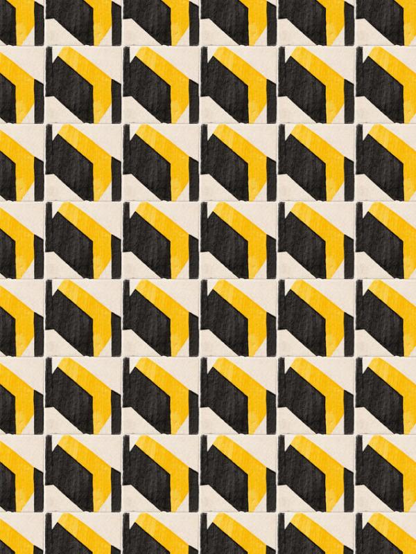
Vector Yellow Black by Neisha Crosland – Modernist Collection
Bottom of Form
Modernist
Modernist is perhaps the clearest demonstration that Neisha’s sensibility is not dependent on floral or historically ornate motifs. Here the starting point was a set of lino-cut prints from art school, and the resulting collection leans into simple motifs arranged in repeating sequences. That can be seen in designs such as D-Bar Duo, Shuttle Mono, Radar, and Tectonic, where the visual language is pared back to bars, arcs, and directional forms that feel exact without becoming severe.
The affinities Neisha later identified - Vienna Secession, Josef Hoffmann, De Stijl, and Bauhaus - make sense at once, yet the terracotta body and hand-finished glazes prevent the collection from becoming austere. In pieces such as Limpet Duo Cerulean Olive, Vector Denim Black, and Tectonic Olive, matt-to-gloss variation, visible brush traces, and the subtle life of the fired clay keep the surface warm, tactile, and inhabited.
This clearly shows that architectural pattern need not be lush to be emotionally convincing. Geometry, when held in the right material register, can feel every bit as atmospheric as floral ornament.
Having examined Neisha’s four collections for Paris Ceramics, let us now have a look at the historical evolution of the techniques and craft in decorative ceramic tiles. In the next section, we present a summarized overview merely for context, as the subject is too vast for the scope of this particular article, and will benefit from more in-depth handling in future posts.
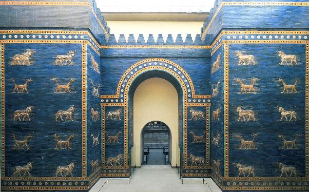
Ishtar Gate – Pergamon Museum, Berlin
A Short History of Hand-Painted Ceramic Tiles
From Babylon to the Islamic World
Long before the technical advances of the early Islamic period, the Near East had already demonstrated the architectural use of glazed surface in the Ishtar Gate at Babylon, built around 575 BCE under Nebuchadnezzar II. Its Processional Way and gate were made from burnt bricks, many moulded in relief with lions, bulls, and dragons and finished with glazed brick reliefs against a vivid blue field. The method was architectural from the outset: image, colour, relief, and brick construction were conceived together rather than applied afterwards.
In the early Islamic world, the technical direction changed. From the 8th century, potters in Egypt and the Levant developed tin-opacified yellow and white glazes, creating an opaque painted ground rather than a translucent one; these technologies then spread into Mesopotamia in the 9th century and northern Iran and Central Asia in the 10th century.
In centres such as Basra, blue-painted wares on opaque white grounds became a key development, and later workshops added lustre decoration, a metallic overglaze effect applied over an already fired glaze and fixed in a second firing under reduced oxygen.
In Iran, especially at sites such as Takht-i Suleiman in north-western Iran, tile systems became more architecturally ordered, with stars, hexagons, and star-and-cross formats used to build larger modular fields, while lustre surfaces introduced a more complex response to light.
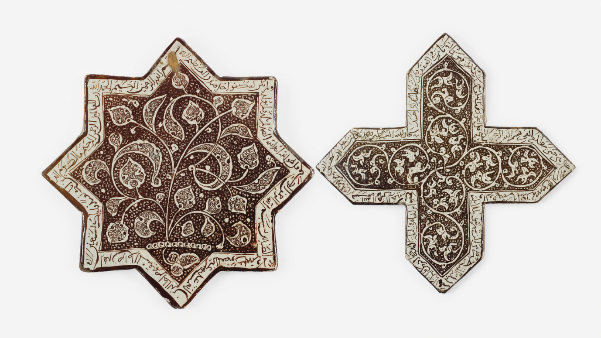
Varamin 13th Century Star and Cross Tiles – Example of Lustre Tile Tradition
As exemplified in the above image, this is not a tradition we at Paris Ceramics admire only at a distance. At the request of Queen Noor of Jordan, of the Royal Hashemite Court, Paris Ceramics was commissioned to produce exact replicas of the medieval Varamin star and cross tiles with gold lustre calligraphy, on permanent display in the British Museum.
This traditional technique of lustre tiles would in time move further west, beyond Iran, and be the subject of many artisanal innovations. However, Islamic culture was not the only one to have lasting influence on hand-painted ceramics tiles, as we shall see in the next section.
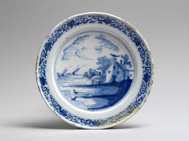
Dutch Delftware
How Asia Influenced Dutch Hand-Painted Ceramics
Although Chinese porcelain was a major catalyst for Dutch Delftware, the Dutch response was shaped by both Asian imports and existing European tin-glaze practice, and it was in the early 17th century that late Ming blue-and-white porcelain entered the Dutch Republic through the trading networks of the Dutch East India Company.
What the Dutch admired was not just the palette, but the whole ceramic system: a hard white body, cobalt-blue painting, and a clear glaze, in other words a complete surface logic rather than a colour scheme alone.
Unable to make true porcelain, Dutch makers adapted the look using tin-glazed earthenware, creating what became Delftware: a softer-bodied but distinctly European ceramic tradition that translated Asian colour and surface logic into a local language of tiles, vessels, and domestic interiors.
In Iberia, as we will see, a different route of exchange would come to produce yet another ceramic tradition with its own architectural life.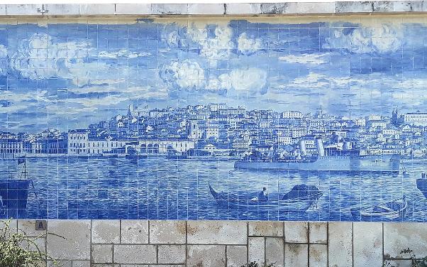
Azulejo Panel in Lisbon, Portugal
North Africa and the Origins of the Portuguese Azulejo
The story of the azulejo is equally as layered as that of Dutch Delftware. It is not simply a Portuguese blue-and-white tradition which emerged in isolation, but a hybrid architectural language shaped by North African, Islamic, and Spanish traditions.
Its success was also technical, since glazed tile proved especially well-suited to Portugal’s climate: porous clay protected by reflective glaze was capable of resisting humidity and salty air while enlivening façades and interiors with light, colour, pattern, and a durable architectural skin. The azulejo endured not simply because it was beautiful, but because it solved practical architectural problems elegantly.
In the next section, we will briefly look at how the revival of hand-painted tile followed yet another path, shaped by glaze experimentation as much as by the Arts and Crafts reform in Britain.
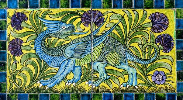
William de Morgan Tile Panel – Late 19th Century
Britain, and the Hand-Painted Ceramic Tile Revival
In 19th-century Britain, painted ceramic tile gained new force through two linked developments: technical innovation and the Arts and Crafts design reform. William De Morgan advanced the ceramic side through complex glaze work, especially lustre, and a more experimental approach to tile production, drawing strongly on Middle Eastern sources.
William Morris, though not chiefly a tile designer, gave decorative surfaces a stricter design logic through his insistence on discipline, handwork, integrity of making, and the proper ordering of repeat. Together they helped shift hand-painted ceramic tile away from mere utility and towards a more serious decorative medium.
For Paris Ceramics, figures such as these belong to the broader British craft lineage that gives important context to Neisha Crosland’s collections, which sit not as isolated designs, but within a longer tradition of ceramic craftsmanship, colour, and pattern. That historical background also clarifies why the tile-making process deserves closer attention, which is the focus of our next section.
Hand-Forming the Terracotta Body
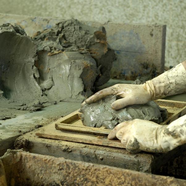
How Hand-Painted Ceramic and Terracotta Tiles Are Made
If decorative ceramic tile is to remain convincing, its beauty must be inseparable from its making.
This is particularly true of the Neisha collections, which depend not just on motif but on a sequence of technical and artisanal decisions: terracotta body, glaze choice, screen print, hand-painting, stencil work, firing behaviour, and the management of crackle and variation. Let us begin by looking at the clay body itself.
Terracotta Body
Terracotta is not incidental here. It brings warmth, softness, and a certain generosity of surface that would be quite different in porcelain or another denser ceramic body. Even before decoration, it establishes a mood.
Fired clay is more tactile, more forgiving to the eye, and more capable of absorbing a sense of age and use. It also allows the collections to sit comfortably within the wider Paris Ceramics world, where old surfaces, handmade materials, and subtle irregularity are central values. From there on, it is glaze which determines how that body will hold colour and light.
Glaze
Glaze is where colour becomes atmosphere, and determines sheen, depth, and how light will move across the tile. In the Neisha collections, finishes often move between matt and gloss rather than settling into a single industrially uniform reading. That variation matters because it allows the pattern to breathe. A completely even glaze can flatten a hand-made tile; yet a more irregular glaze gives the surface movement. The next stage is how the image is actually put onto the tile.
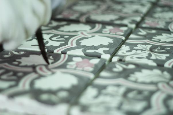
Hand-Painting and Screen Printing
The collections use different combinations of techniques. Some motifs are hand-painted more directly. Others are screen-printed and then finished by hand. In Floris, certain elements are guided by intricate stencil work and refined with fine-bristled brush painting.
In more layered designs, the stencil process can be complex, with different acetate stencils used sequentially so that one part of the pattern is laid down, then another, then another. Dots, crosses, fine lines, and secondary motifs may all require separate stages.
This is one reason complexity affects both lead time and cost. It is not a decorative surcharge in the abstract. It is an accurate reflection of how many times the tile must pass through the hand. As we will see next, one of the clearest signs of that process remains visible in the finished surface itself.
Crackle and Crazing
Crackle, or crazing, is one of those phenomena that sits beautifully at the junction of chemistry and aesthetics. It occurs when clay body and glaze cool and contract at slightly different rates. In many industrial contexts this might be treated as a fault to be eliminated. In more historically minded ceramic work, it becomes part of the surface language.
The fine network of crackle lines catches pigment, light, and time in a way that gives the tile a more lived and atmospheric character. In the Paris Ceramics world, this is never accidental; it is understood, managed, and often enhanced as part of the visual finish.
In our next section, we will look at how the workshop behind that finish is just as important as the technical sequence itself.
Hand-Finishing Tiles at Le Nid – an Artisanal Workshop
The Sicilian Workshop Behind the Collections
The Sicily thread is not incidental to the Neisha Crosland collections. It leads directly to Le Nid, the Sicilian studio with which Paris Ceramics collaborates, where the making of the tiles is as important as the designs themselves.
Le Nid works within a family ceramic tradition and is central to the translation of Neisha’s ideas into fired surface. That connection helps explain why these collections are bespoke creations, shaped by workshop processes, glaze behaviour, and hand-finishing from the outset.
This is especially clear across the Neisha ranges. Haveli and Floris rely on handmade terracotta bodies and hand-painted decoration. Modernist uses hand-painted terracotta with controlled matt-to-gloss variation and visible brushmarks, which give the designs more warmth and surface movement. Botanica combines screen printing with hand painting on a crackle eggshell glaze terracotta base, so the final result retains both clarity and variation.
In other words, Le Nid is not simply producing the tiles. The studio is responsible for much of what gives the collections their material character: the terracotta body, the glaze finish, the crackle, the brushwork, and the slight differences from tile to tile that keep the surfaces alive.
For Paris Ceramics, that workshop role is fundamental. Neisha provides the design language, but Le Nid gives it ceramic form through making, firing, and finish. That is why the collections read as serious decorative surfaces rather than abstract patterns transferred onto clay.
However, once the finished product is ready, how and where should it be used, and what specifications should one bear in mind? In our next section, of particular interest for architects and interior designers, we will look directly into questions of use, build-up, and application.
Technical Specification and Practical Considerations
For architects, interior designers, and discerning homeowners, the practical questions are just as important: where a material can be used, how it should be installed, how the joints will read, and how it should be maintained over time. With hand-painted ceramic tiles, those decisions affect both performance and finish.
Application and Fit-For-Purpose
The first question is whether the material is right for the setting. Hand-painted ceramic tiles can be highly durable, but they are not universal in application. Exterior use, harsh weather exposure, and some high-wear conditions may call for a different substrate or a different specification altogether.
Where a client wants the visual language of a pattern in a setting that may not suit the original tile body, it can sometimes be more appropriate to translate the design onto another material. The important thing is that the decorative effect remains technically sound.
When climate is an issue, for example, the pattern can be translated onto another substrate, such as lava stone, giving the client the architectural effect while respecting the realities of weather, wear and performance, and here at Paris Ceramics, this is precisely the sort of problem-solving we take into consideration on a project-by-project basis. This can be especially relevant when considering kitchen splashbacks, bathroom walls, shower walls, fireplace surrounds, decorative wall panels, and feature walls.
Thickness and Build-Up
One of the most useful practical points to consider is thickness and build-up, especially in renovations, shower areas, splashbacks, and projects where finished levels need close control.
Key points to note:
- Some handmade and hand-painted ceramic collections are commonly produced at around 20 mm.
- Thinner versions, around 10 mm, may sometimes be possible where wall build-ups or floor transitions are tighter.
- Where a cement-based mortar bed is used, the bed may be around 2 to 3 cm thick.
- Final allowances should always be checked against the specific collection, substrate, and site conditions.
Installation
Hand-painted ceramic tiles should not be approached like a standard factory tile. Substrate preparation, fixing method, grouting sequence, and clean-up all affect both durability and appearance, so installation is best carried out by an experienced installer familiar with handmade materials.
Key points to note:
- Hand-painted ceramic tiles may be installed either with a cement-based mortar bed or with a suitable special flooring adhesive, depending on the application.
- The substrate should be level, sound, and free from dust, grease, wax, loose material, and other contaminants.
- Tiles should be laid under firm pressure and with consistent spacing between units.
- On larger surfaces, expansion joints should be introduced to accommodate thermal movement.
- Before grouting, the surface must be dry and the tiles fully set in place.
- Where a mortar substrate is used, grouting may need to wait at least 15 days, depending on screed thickness, weather conditions, and substrate absorption.
- Excess grout should be removed immediately, and the surface cleaned carefully with a clean damp sponge once the grout is touch dry.
A careful installation, bearing the above points in mind, preserves the steadiness of the pattern and the quality of the glaze.
Cutting, Drilling and Joints
These details are easy to underestimate, but they have a direct effect on how resolved the finished surface feels.
Key points to note:
- Straight cuts are best made with a water-cooled cutting machine fitted with the correct disc.
- Irregular cuts may be made with a steel string suitable for glass.
- Cut edges should be bevelled using diamond pads or fine-grained glass-paper.
- When drilling, use diamond cutters, keep the drilling area wet, work at reduced speed, and avoid percussion.
- A joint width of at least 3 mm is generally advisable.
- Before using a grout colour that contrasts strongly with the tile, it is wise to test it on a small area first.
The distinction to be made between good or bad jointing is that good jointing supports the design quietly, whereas poor jointing competes with it.
Bespoke Colour Work
The catalogue is a starting point, but it should not be a constraint. One of the strengths of working with Paris Ceramics is that colour can often be adjusted in response to a wider scheme. A blue may need to shift towards teal, become paler and more washed, or sit more quietly beside timber, paint, textile, or stone.
That flexibility is often what allows a decorative ceramic surface to feel fully integrated rather than simply applied.
Bespoke colour adjustment is therefore not a luxury extra so much as one of the mechanisms by which the work gains coherence.
Maintenance and Cleaning
Maintenance is straightforward, but it should not be careless. Hand-painted ceramic tiles are durable and relatively easy to care for, yet the wrong cleaning approach can dull the surface or damage the finish over time.
Key points to note:
- After installation, the surface should be cleaned carefully to remove grout residue.
- Before using any product to remove grout residue, wet the surface first so that the joints are protected.
- After cleaning, the surface should be rinsed thoroughly and dried properly.
- For daily cleaning, use a detergent suitable for ceramic surfaces diluted in hot water.
- Avoid acids, aggressive detergents, abrasive tools, alcohol, and ammonia-based cleaners.
Like installation, maintenance shapes the long-term quality of the surface. Cleaned properly, hand-painted ceramic retains its clarity and finish far better over time.
The Paris Ceramics Philosophy
We have never believed that decorative ceramic tile belongs in a separate, lesser category from stone, mosaic, or other more obviously architectural materials. At its best, it is every bit as intelligent, because it asks colour, line, craft, firing, and architecture to speak together within a single surface language.
That is why Neisha Crosland’s work and the artisanal care behind it are so valued here at Paris Ceramics. Not because they give us something beautiful to add to a catalogue, but because they sharpen and extend a conversation we have always cared about: how surfaces carry culture, memory, atmosphere, and visual rhythm into contemporary rooms.
The longer history of painted ceramic tile helps explain why these collections feel so grounded, and the collections themselves show why that history, and the workshops that keep it alive, still deserve protection and renewal.
For us, that is the real point, because decorative ceramic tile is not a relic of old houses, nor a charming aside to harder architectural materials. It remains one of the most persuasive ways of bringing rhythm, craft, and visual memory into the architectural envelope; in Neisha Crosland’s hands, and through the materials and workshops that shape her collections, it continues not only to survive, but to speak with remarkable freshness.
CPD Template for Architects
CPD Template for Architects
Logging This as CPD
If relevant to your role, current projects, or wider professional development, this article may be recorded as unstructured CPD.
Suggested Core Topic
Pattern-led ceramic surfaces and the specification of hand-painted terracotta tile in contemporary architectural and interior projects
Suggested Learning Format
Self-directed reading
Estimated Reading Time
26 minutes
This Article Covered:
The relationship between Neisha Crosland’s pattern language and and-painted ceramic and terracotta tile surface
- The historical roots of painted ceramic tile, including tin-glaze, lustreware, Delftware, azulejo traditions, and the British revival of hand-painted ceramic tile
- The distinct visual and material identities of Haveli, Floris, Botanica, and Modernist
- The role of terracotta bodies, glaze behaviour, crackle, hand-painting, screen printing, and stencil layering in decorative tile production
- The contribution of specialist workshops, including the Sicilian studio Le Nid, in translating designer intent into architectural ceramic surfaces
- Practical considerations around thickness, build-up, jointing, bespoke colour adjustment, fit-for-purpose use, installation logic, and maintenance
- The use of hand-painted ceramic tile in settings such as kitchen splashbacks, bathroom walls, shower walls, fireplace surrounds, decorative wall panels, and feature walls
- Why patterned ceramic tile remains relevant in contemporary specification
Suggested CPD Record Summary
This article developed my understanding of decorative ceramic tile as an architectural surface category rather than a merely decorative finish. It clarified how Neisha Crosland’s collections for Paris Ceramics can be understood through both historical ceramic traditions and present-day specification needs, while also identifying practical considerations such as thickness, glaze behaviour, bespoke colour adaptation, application suitability, installation, and maintenance.
Suggested Reflection
How might patterned ceramic tile alter my approach to spatial rhythm, surface hierarchy, and architectural atmosphere in projects that require more than neutral or standardised finishes? Where might hand-painted or glaze-led ceramic surfaces provide a stronger answer than wallpaper, stone, or plain tile?
Please Note
This content is intended for independent professional learning and should not be treated as accredited CPD unless expressly stated otherwise.
CPD Template for Interior Designers
CPD Template for Interior Designers
Where relevant to your professional practice, this article may be useful to log as self-directed or unstructured CPD.
Suggested CPD Record
Date completed: [DD/MM/YYYY]
Activity title: Neisha Crosland and the Art of Hand-Painted Ceramic and Terracotta Tile
Provider / publisher: Paris Ceramics
Format: Online article / self-directed reading
CPD category: Unstructured CPD
Estimated Reading Time: 26 minutes
Link: [Insert article URL]
What Did You Learn?
This article explored the ceramic collections developed by Neisha Crosland with Paris Ceramics and set them within the wider history of painted decorative tile. It explained how terracotta, glaze, hand-painting, screen printing, stencil work, and crackle contribute to the final character of a surface, and showed how collections such as Haveli, Floris, Botanica, and Modernist differ in mood, motif, palette, and historical reference. It also clarified practical concerns such as thickness, colour adaptation, jointing, fit-for-purpose application, installation, and maintenance, while showing the importance of specialist ceramic workshops in the finished result.
Why Is This Relevant to Your Practice?
For interior designers, the article is relevant because it links visual atmosphere to real material decisions. It shows how decorative ceramic tile can shape the mood, rhythm, and identity of a room in ways that differ from paint, wallpaper, or plain tile, while also requiring technical judgement around build-up, finish, installation, maintenance, and bespoke adaptation.
Actions / Follow-up
- Review whether hand-painted or pattern-led ceramic tile may be more suitable than wallpaper or flat-colour tile in current or future schemes
- Consider where the different registers of Haveli, Floris, Botanica, or Modernist might support a project narrative
- Pay closer attention to glaze, sheen, crackle, grout tone, and joint rhythm when selecting decorative ceramic surfaces
- Review application suitability for kitchen splashbacks, bathroom walls, shower walls, fireplace surrounds, decorative wall panels, and feature walls
- Revisit the Paris Ceramics ceramic and collaboration collections for future project reference
Please Note
This content is intended for independent professional learning and should not be treated as accredited CPD unless expressly stated otherwise.